A Color You’ve Never Seen (Until Now)
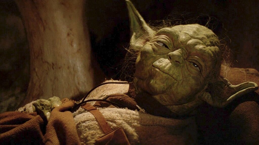
One of the most iconic characters in the Star Wars galaxy, Yoda’s tiny green-skinned figure is instantly recognisable. But what if we told you he almost looked very different? Archival sources indicate that Yoda’s original concept and early script references described him as a bluish creature, not the emerald sage we know today.
The Evidence: Script, Concept Art & Comics
According to early drafts of The Empire Strikes Back, the screenplay described Yoda’s first appearance on Dagobah thusly:
“Mysteriously standing right in front of Luke is a strange, bluish creature, not more than two feet tall. The wizened little thing is dressed in rags.”
In addition to the draft, early Marvel Comics adaptations of the film, based on the screenplay, portrayed Yoda with blue or purplish tones — a clear indication the final green came later.
Concept art from the late 1970s also shows Yoda in a range of colours including light blue and pink, further supporting the idea that his final appearance wasn’t locked in until late in production.
Why the Change to Green?
While no official reason has been provided by George Lucas or Lucasfilm, effects artist Nick Maley—who worked on Yoda’s make-up—shared some insight:
“We actually put dyes into the foam latex so that we didn’t have to paint it too much. That was green.”
He also speculated that green may have been an obvious choice: “I mean, I assumed everybody kind of tended to think: ‘Oh, Martians are little green characters.’”
Another practical consideration: early onscreen effects and lighting might have made a blue skin tone harder to read against the swampy greens of Dagobah or computer film processes at the time. While this hasn’t been officially confirmed, it’s widely speculated among Star Wars scholars.
Why This Matters to Fans
It’s one thing to talk about concept art. But to know that Yoda’s iconic look nearly took a completely different path? That’s fascinating. For collectors, storytellers and fans alike:
- It shows just how many design decisions happen behind the scenes.
- It underlines how final film choices involve story, aesthetics and production constraints.
- It gives new depth to the character’s evolution — from “bluish creature” to the legendary green Jedi Master.
Imagine the Alternative
Think of the image: the wise, small creature, glowing blue against the fog of Dagobah—what would that have done to his visual identity? Would Grogu (aka “Baby Yoda”) look different? Would other aesthetic choices in the franchise (lightsaber colors, alien skin-tones) have shifted? The butterfly effect here is huge for fans of Star Wars art and design.
Final Thoughts
Yoda’s green skin is iconic—but now we know it nearly wasn’t. The archive materials, old comics and prototype visuals all point to an earlier version that was far different. For those who love Star Wars trivia, concept art or filmmaking history, this revelation is a delicious nugget of “what-might-have-been.”
Next time you see Yoda (or Grogu) gazing knowingly into the distance, remember: he almost looked different.
source: The Guardian
Stay connected with the galaxy’s latest updates!
Follow us on X, Facebook, Instagram, or Pinterest for exclusive content, mod guides, Star Wars gaming news, and more. Your support helps keep the Holonet alive—one click at a time


