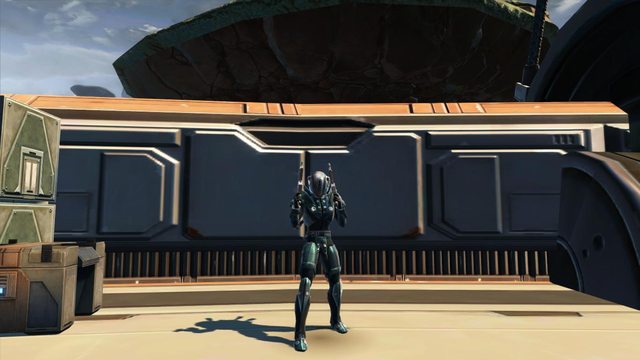
This week’s update have arrived! After two amazing weeks with a new planet and a Timeline holorecord, it’s now time for Fan Friday and new biographies.
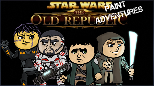
First up, Fan Friday. As the name says, we’re not suprised that BioWare was able to dig out some treasures from the official forum grounds. The interactive TOR Paint Adventures and KariaVen’s animations are only two examples of the great creativity of Star Wars fans.
It wouldn’t be Fan Friday without a couple more polls! The first asks, “Who is your favorite character in the Blood of the Empire webcomic series?” The second poll asks, “Which class are you planning on trying out first?”
This time the development corner look at the creation of Kaas City, the Empire’s capital. Senior Concept Artist Ryan Dening gives us another step-by-step demonstration of taking a concept and turning it into a finished piece of artwork.
The purpose of this concept was to revisit Kaas City. A lot of the work had been done earlier on, and we felt there were things we could do to make it so much cooler.
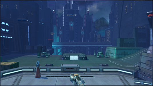
We already had a view of the city since it had been built in-game, but we wanted to integrate it into the surrounding landscape better and give the Imperial city its own architectural style. Also, we wanted to establish a stronger mood and define the Citadel better (main central building). I started with screenshots from the game to make sure I wasn’t moving anything important and to make sure I captured the player’s view.
For inspiration I looked to the sketches of Coruscant by Ralph McQuarrie. Some of them have a dark gothic feel and I wanted to portray that in the Sith Empire‘s capital city. Clint Young had done an earlier concept of the Citadel, and I wanted to re-incorporate some elements from his design. Our style for the Empire is very angular so I felt that should be reflected in their architecture, as well.
I went into the game and took screenshots of the view I wanted to capture looking out towards the Citadel.
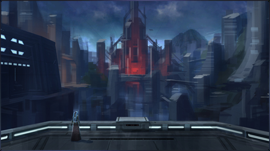
I kept the front platform and the building to the left as I knew they were going to stay. I added in some perspective guides to help me keep everything in-line, and then I loosely blocked in some shapes and colors to get the overall composition.
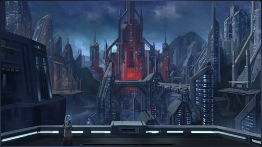
In order to refine the shapes and designs, I began building up forms with highlights and shadows. I cut in some details for the foreground building on the left from an existing concept Clint had done, and started adding some finer details like windows for scale.
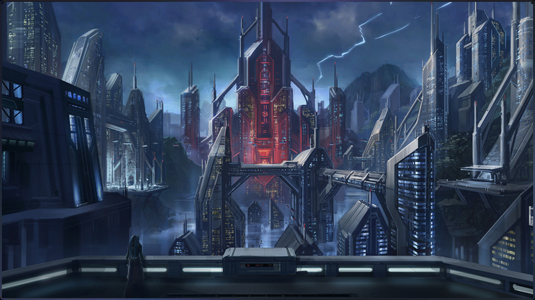
The finished concept. I filled out the lighting and continued to refine details. From here, individual elements can be broken out in more detail for the environment artists to build.
If you don’t like planets that much, but are more into delving into deep space, you should download one of the four new wallpapers, which all deal with spaceships in some way or another. Visit the media section to download the resolution that best fits your monitor.
 |
 |
 |
