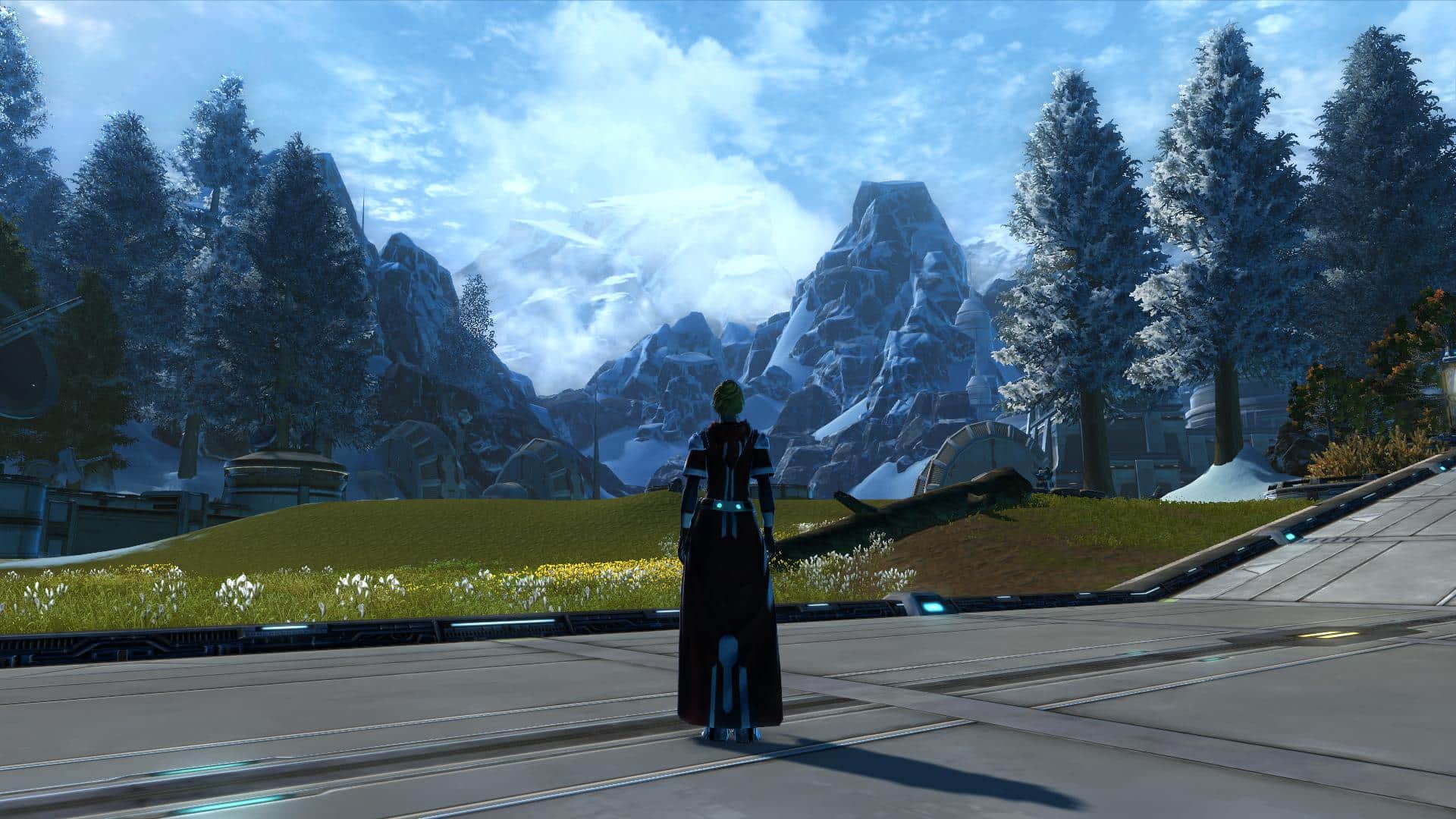
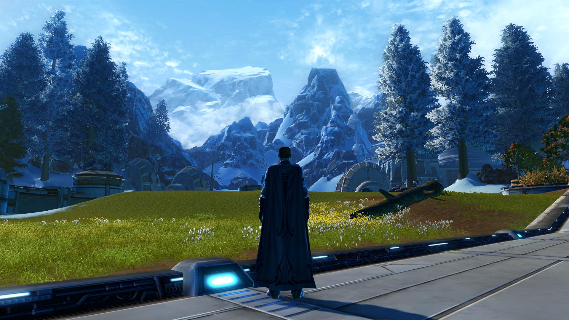
SWTOR is getting something of a makeover in terms of colors. Most will agree that it’s an improvement but for those who have grown accustomed to seeing it in its darker fashion might not approve. Personally, I like it. I really think some zones were just a bit too dreary and drab with all the grey/brown. I like the improved colors and crispness of it all.
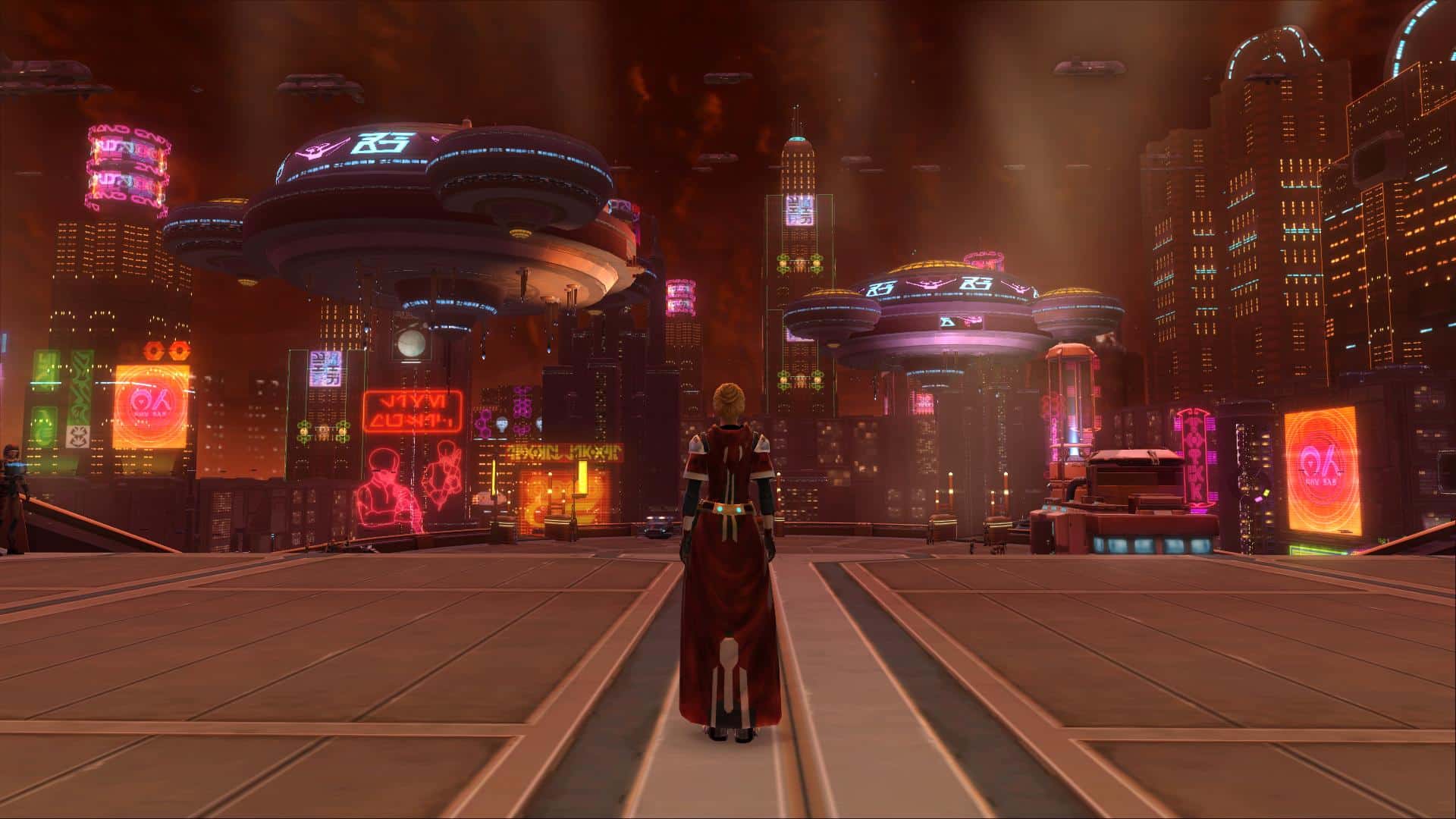
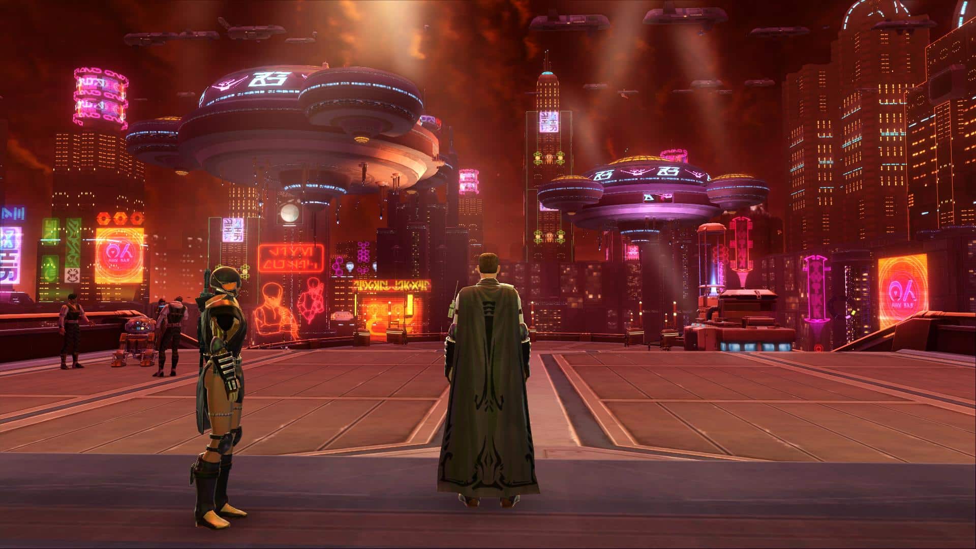
It also seems to have more of a real feel and texture rather than the cartoony feel in some zones. I like this. One user shared some before and after pics on Reddit to help us see what the color changes look like:
What’ll strike you first is the sheer colour in the game. These screenshots were taken in the exact same locations, with the same gamma/brightness/graphics settings.
After:
Before:
After:
To be honest, while I think this is a good move, I think the game needs a lighting overhaul in general.
Again, I kind of have to agree here that even on some of the brightest planets in the game, everything always struck me as too dark. In fact, sometimes it even seemed like the shadows were too dark and I would get headaches after playing in certain zones for long periods of time.
I think it’s a subtle enough change not to look like a whole new game but a good enough change to make it all have a fresher feel to it.
What do you think about the new lighting? Good or bad?